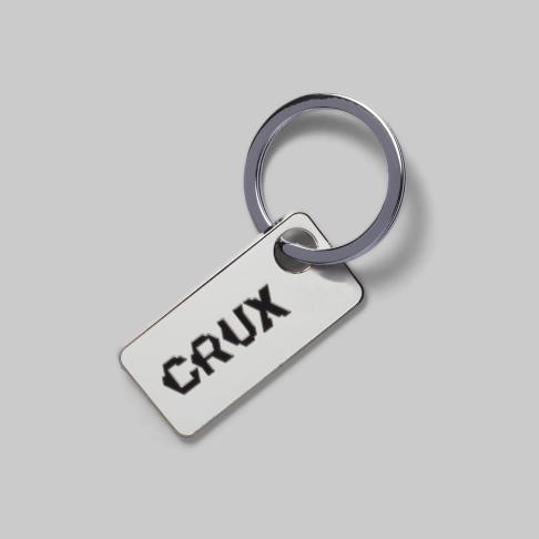
Crux
2023
2023
Crux is a bouldering community and training app for urban climbers. The crux means the toughest section or route in climbing. However, the brand name embraces hardship and associates it with an exciting journey of resilience.
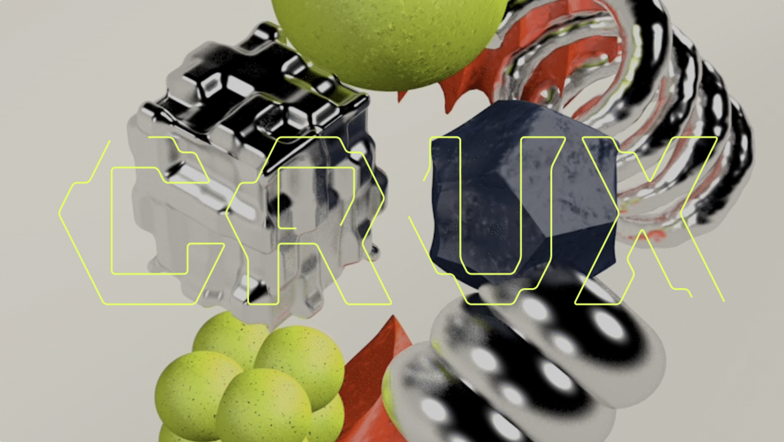
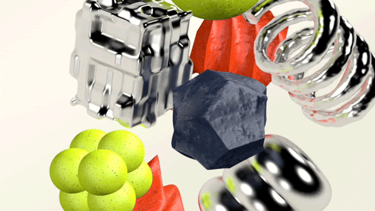
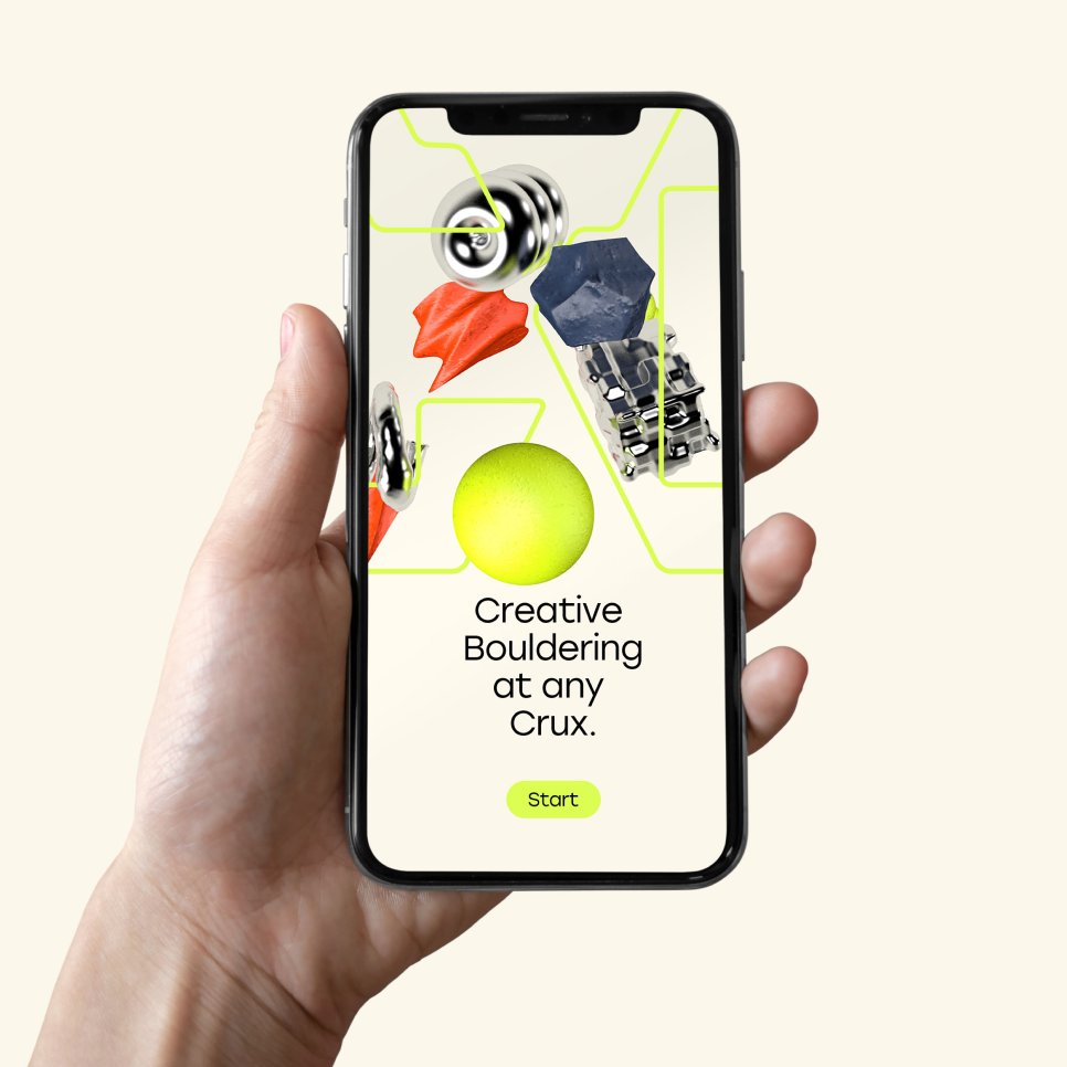
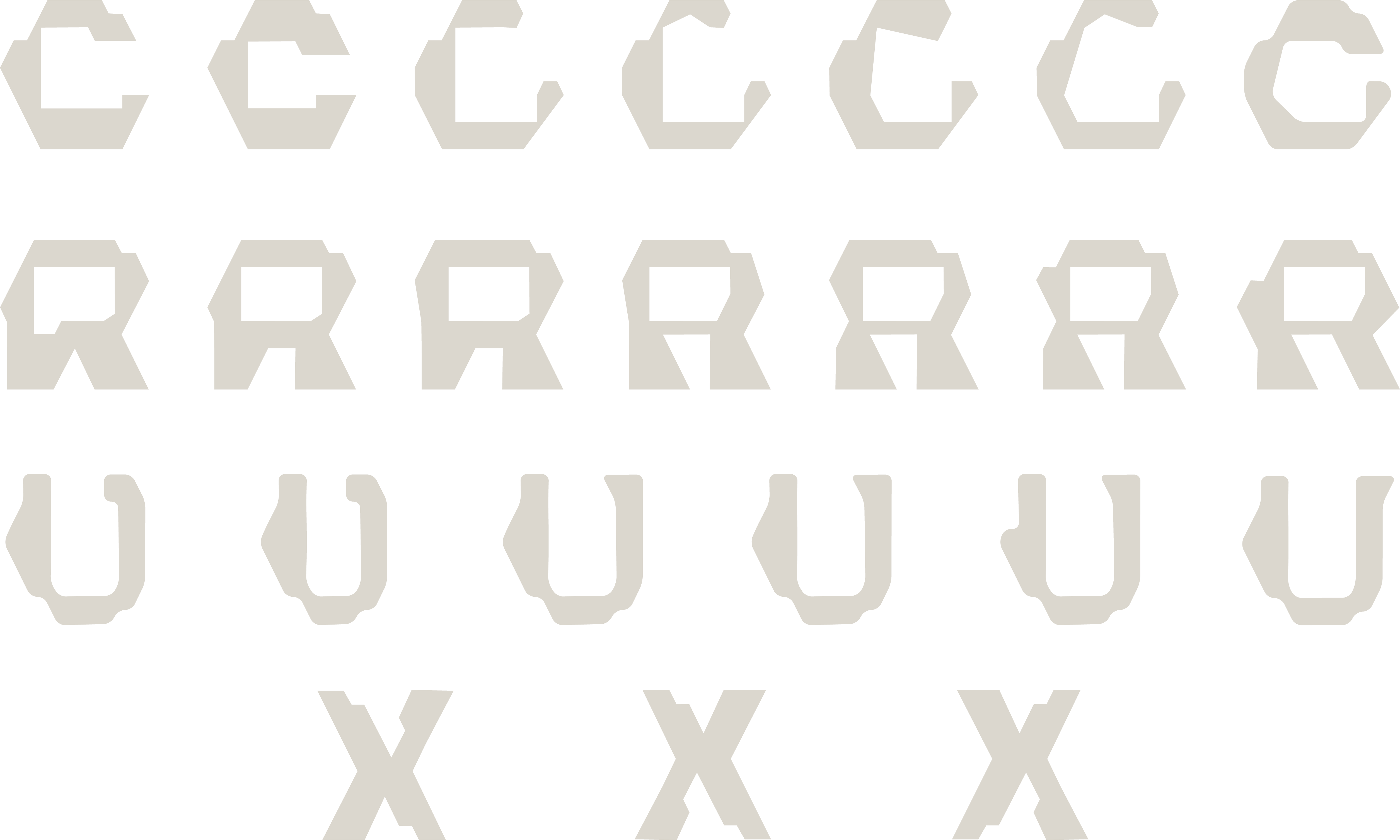
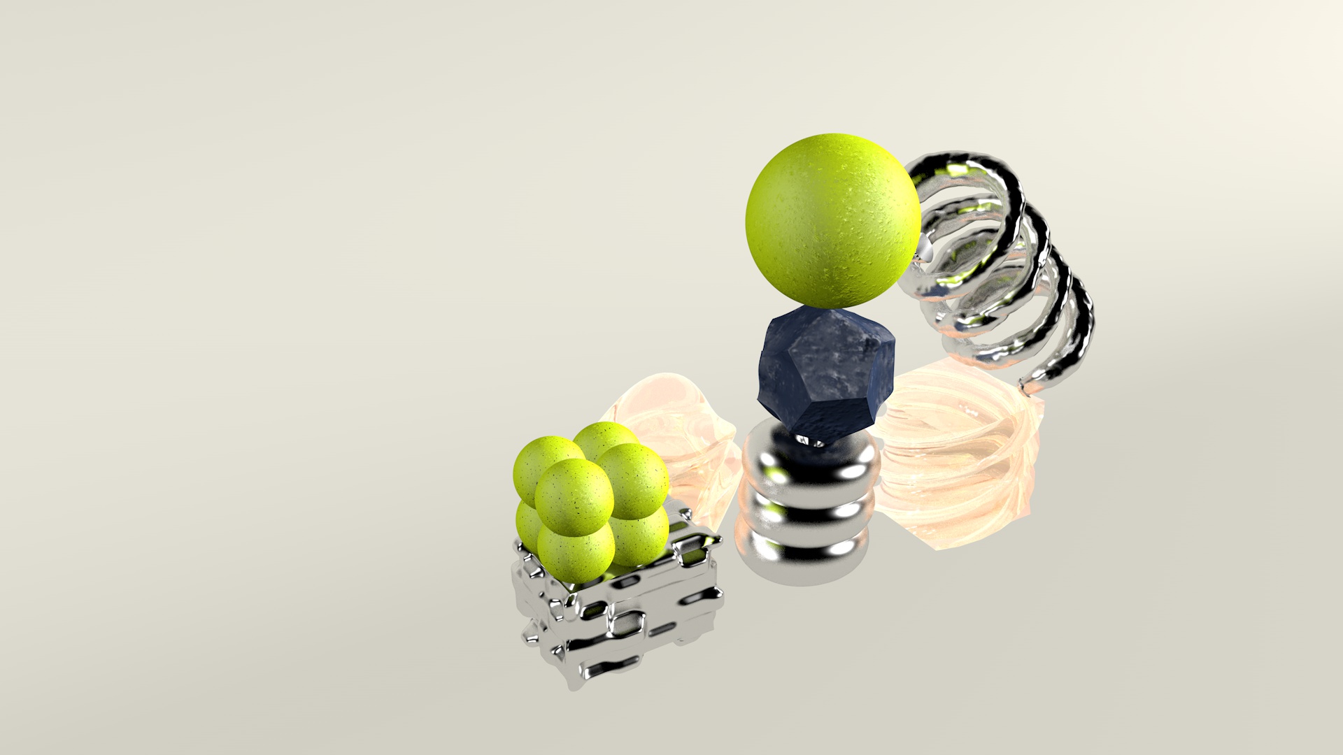
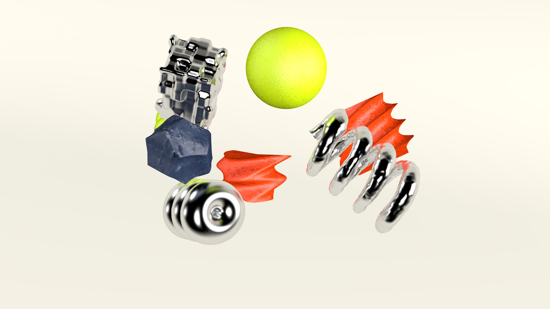
The logotype resembles the rocky shape of C, which echos a strong grip of the climber’s hand. Along with the logotype, the vibrant 3D-modeled figures expand the climbing handle as a visual language of contemporary outdoor activity. Vivid geometry and abstract shapes encourage the city climbers with a friendly and playful community.
The logotype resembles the rocky shape of C, which echos a strong grip of the climber’s hand. Along with the logotype, the vibrant 3D-modeled figures expand the climbing handle as a visual language of contemporary outdoor activity. Vivid geometry and abstract shapes encourage the city climbers with a friendly and playful community.
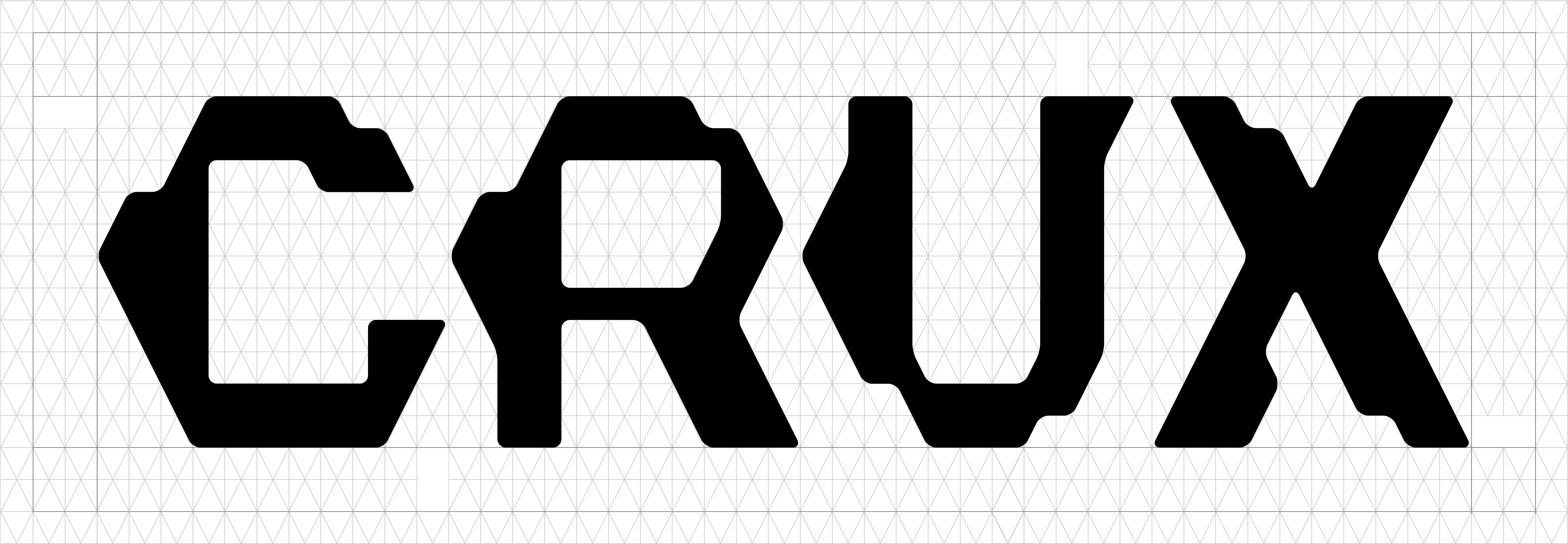


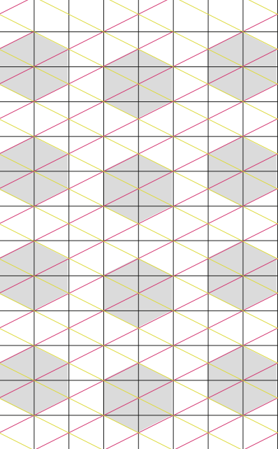
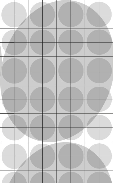
PROCESS
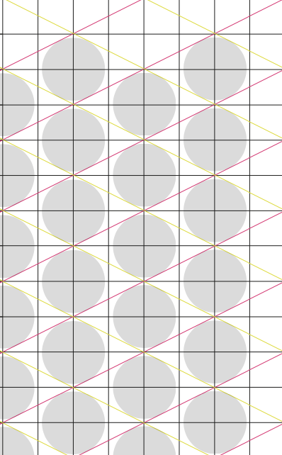
Logotype development from the grid
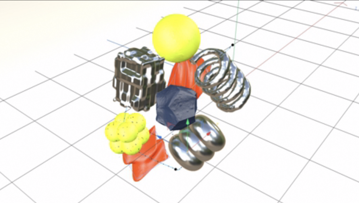

Branding Logotype Cinema 4D